







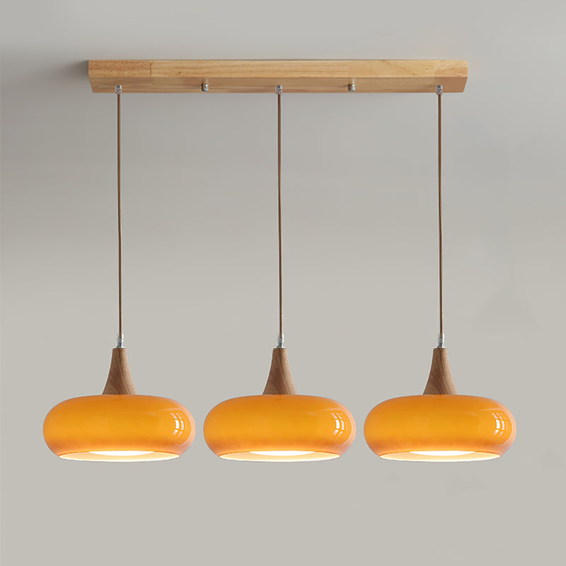


Bubilas Pendant Light Wood
Description
Inspiration
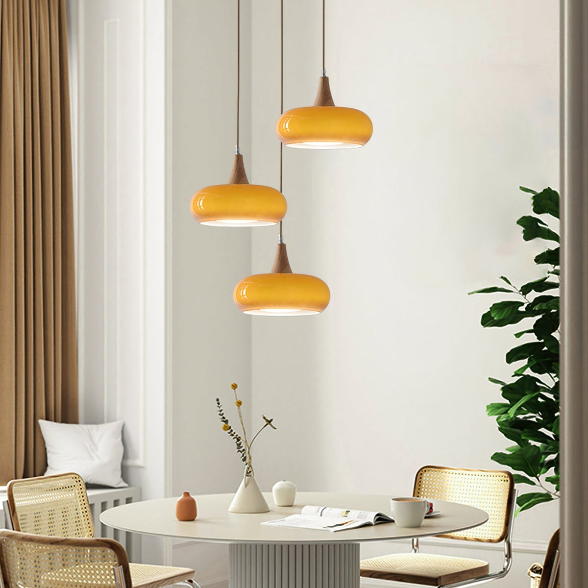
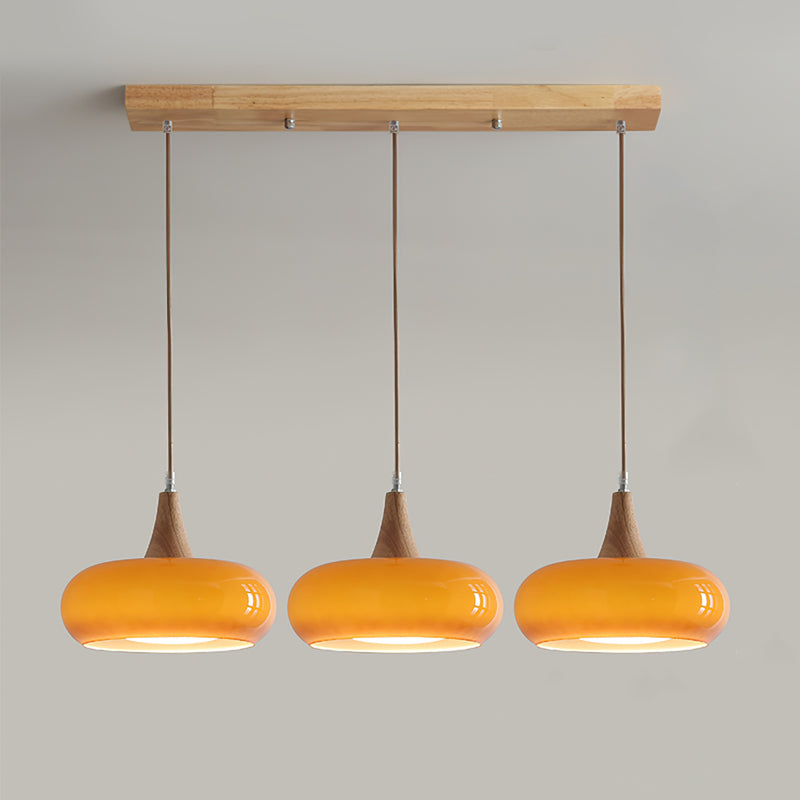
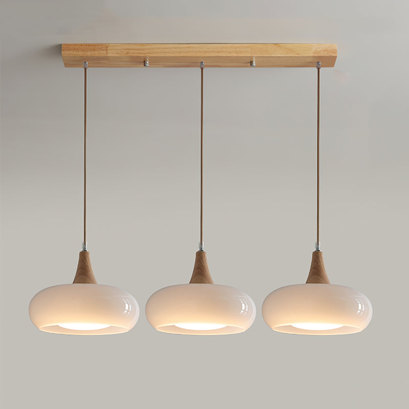
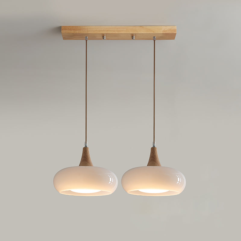
Featuring an amber glass shade. wood top. and sleek metal detail. this pendant light brings warm. ambient light to kitchens. dining rooms. or cozy nooks.

| Product Details | |
| Product Type | Pendant Light |
| Product Style | Bubilas |
| Best Match With | Bedroom / Living Room / Dining Room |
| Perfect with Room Size Around (Sq) | 5㎡-10㎡ |
| Indoor/Outdoor | Indoor |
| Dimmable | / |
| Color Temperature | Without Bulbs |
| Assembly Required | Yes |
| IP Rate | IP20 |
| Power Source | Hardwire We provide 150cm . Can be extended upon request. |
| LightSource | |
| Bulb Included | No |
| Bulb Type | LED / Incandescent / Fluorescent |
| Bulb Base | E26 / E27 |
| Number of Bulbs | / |
| Voltage (V) | 110V-240V |
| Maximum Wattage(W) | / |
| Material | |
| Primary Material | Metal + Glass |
| Fixture Material | Metal |
| Shade Material | Glass |
| Dimensions | |
| Product Weight (lbs) | / |
| Chain/Cord Adjustable | Yes |
| Size | See Images |
| Included Components | |
| 1* Pendant Light | |
| Note | |
| Please kindly note that there may be an error of 1-3cm of the size due to manual measurement.The pictures may have slight chromatism due to the light and the monitor.Your understanding is appreciated.It's recommended that the installation of the lamp is performed by a professional electrician. | |
Inspiration
Featuring an amber glass shade. wood top. and sleek metal detail. this pendant light brings warm. ambient light to kitchens. dining rooms. or cozy nooks.
| Product Details | |
| Product Type | Pendant Light |
| Product Style | Bubilas |
| Best Match With | Bedroom / Living Room / Dining Room |
| Perfect with Room Size Around (Sq) | 5㎡-10㎡ |
| Indoor/Outdoor | Indoor |
| Dimmable | / |
| Color Temperature | Without Bulbs |
| Assembly Required | Yes |
| IP Rate | IP20 |
| Power Source | Hardwire We provide 150cm . Can be extended upon request. |
| LightSource | |
| Bulb Included | No |
| Bulb Type | LED / Incandescent / Fluorescent |
| Bulb Base | E26 / E27 |
| Number of Bulbs | / |
| Voltage (V) | 110V-240V |
| Maximum Wattage(W) | / |
| Material | |
| Primary Material | Metal + Glass |
| Fixture Material | Metal |
| Shade Material | Glass |
| Dimensions | |
| Product Weight (lbs) | / |
| Chain/Cord Adjustable | Yes |
| Size | See Images |
| Included Components | |
| 1* Pendant Light | |
| Note | |
| Please kindly note that there may be an error of 1-3cm of the size due to manual measurement.The pictures may have slight chromatism due to the light and the monitor.Your understanding is appreciated.It's recommended that the installation of the lamp is performed by a professional electrician. | |
Secure Payment
Trusted secure payment, currently accept major credit cards (VISA, Mastercard, AMEX, etc.) and PayPal. Fortified with advanced SSL encryption technology, provides a reliable shield to safeguard your sensitive personal and financial information.
Trusted secure payment, currently accept major credit cards (VISA, Mastercard, AMEX, etc.) and PayPal. Fortified with advanced SSL encryption technology, provides a reliable shield to safeguard your sensitive personal and financial information.
Return Policy
Upon delivery of the goods, you will promptly examine them. If any of the goods ordered have been damaged in transit or have been incorrectly shipped, does not meet your requirements or are defective through faulty material or factory workmanship. Please kindly notify us by writing to us through email at contact@cielum.co.uk within 30 days from the date of delivery of the relevant goods.
Upon delivery of the goods, you will promptly examine them. If any of the goods ordered have been damaged in transit or have been incorrectly shipped, does not meet your requirements or are defective through faulty material or factory workmanship. Please kindly notify us by writing to us through email at contact@cielum.co.uk within 30 days from the date of delivery of the relevant goods.
Lamp Knowledge Science
*A general explanation of the product features for all lighting fixtures. It doesn't mean the product on the current page is dimmable or three colours changeable.
Please check the Description section to find whether the current product is dimmable or not.
- Dimmable version: equipped with a remote control, and can adjust the brightness and colour temperature of the light, not compatible with dimmers.
- Triac Dimmable (Wall Switch Control): Compatible with most standard LED silicon-controlled (Triac) wall dimmers(not included). This version allows you to adjust brightness via your existing wall switch but does not include a remote.
- Three-colour changed by switch version: Controlled by a standard wall switch(not included), allowing you to adjust the color temperature of the light. This version does not have a memory function. Each time the light is turned on, it will reset to the default setting.
Size Tolerance Notice:
All dimensions are manually measured. Due to the unique shapes or craftsmanship of certain lighting fixtures, a deviation of 1-3cm is within the normal range. Please refer to the actual product received for precise installation.
Colour Disclaimer:
Actual colours may vary slightly due to different monitor settings, room ambient light, or the colour temperature of the bulbs used. We appreciate your understanding.
*A general explanation of the product features for all lighting fixtures. It doesn't mean the product on the current page is dimmable or three colours changeable.
Please check the Description section to find whether the current product is dimmable or not.
- Dimmable version: equipped with a remote control, and can adjust the brightness and colour temperature of the light, not compatible with dimmers.
- Triac Dimmable (Wall Switch Control): Compatible with most standard LED silicon-controlled (Triac) wall dimmers(not included). This version allows you to adjust brightness via your existing wall switch but does not include a remote.
- Three-colour changed by switch version: Controlled by a standard wall switch(not included), allowing you to adjust the color temperature of the light. This version does not have a memory function. Each time the light is turned on, it will reset to the default setting.
Size Tolerance Notice:
All dimensions are manually measured. Due to the unique shapes or craftsmanship of certain lighting fixtures, a deviation of 1-3cm is within the normal range. Please refer to the actual product received for precise installation.
Colour Disclaimer:
Actual colours may vary slightly due to different monitor settings, room ambient light, or the colour temperature of the bulbs used. We appreciate your understanding.

I wasn’t sure how the warm orange would look with timber, but the combination feels really natural in person. The colour gives the pendant personality, while the wooden detail keeps it grounded and easy to live with.
This replaced a very basic light and made the room feel more finished without changing anything else. It stays interesting from different angles without looking busy. Up close, the metal is the detail I notice most. The result feels balanced rather than overdone.
This replaced a very basic light and made the room feel more finished without changing anything else. Natural daylight brings out details that were hard to judge on a screen. It feels right at home in our bedroom. It was a simple change that made the room feel much more finished. My only advice is to measure the intended spot first so the scale feels right.
I especially like how the glass looks in natural light. I was trying to make the room feel more intentional without making it look newly decorated. It has held my attention without becoming visually tiring. The design has personality without feeling like something that will look dated quickly.
The design has personality without feeling like something that will look dated quickly. I wanted something with more character than the fitting we had before, but nothing that would make the room feel overdone. The Orange finish works well without needing every other finish in the room to match. I'm still very happy with it.
Being able to adjust the brightness is useful later in the evening. I chose this because the overall form felt different from the usual options without being difficult to work around. The whole setup feels more intentional now. The room feels more complete now even though this was the only thing we changed.
Our room already has a mix of finishes, so I needed something that could stand on its own without forcing everything to match. We chose the Orange version and the finish feels richer in person. The overall form is strong enough that it doesn't need extra decorative details around it. The result feels balanced rather than overdone.
I would recommend this piece to anyone seeking a calm, refined ambiance. The balanced vertical composition and smooth curves create a gentle visual rhythm that feels intentionally artistic. Its cohesive stylistic presence avoids unnecessary ornamentation, focusing instead on fundamental geometric harmony and atmospheric subtlety for a truly sophisticated look.
It gives the area a focal point while leaving plenty of breathing room around it. Our room already has a mix of finishes, so I needed something that could stand on its own without forcing everything to match. The Orange finish works well without needing every other finish in the room to match. I'd choose it again for a similar space.
Up close, the metal is the detail I notice most. We took our time choosing because I wanted something I wouldn't get tired of after a few months. I'm glad I didn't go with the safest option. After the initial novelty wore off, I still notice the design in a good way.
We wanted one strong detail in the room rather than adding more accessories, and this did the job. We chose the Orange version and the finish feels richer in person. It works with the furniture we already owned instead of making the rest of the room feel mismatched. It has held my attention without becoming visually tiring.
We wanted something warmer than white or black above the breakfast table. The orange has enough colour to lift the room, but the rounded shape and wood make the overall look soft rather than loud.
I like that it contributes to the room even when the light is off. We took our time choosing because I wanted something I wouldn't get tired of after a few months. The Orange finish works well without needing every other finish in the room to match. I like it more now than I did on the first day.
The metal gives the design texture without making it feel busy. The design caught my eye straight away, but the way it fits into the room is what I appreciate now. I'm glad I didn't go with the safest option. It looks considered without making everything else in the room feel too casual.
This went into a space we use every day, so I cared more about how it would feel long term than how dramatic it looked online. The glass has more depth in person than I expected. It works with the furniture we already owned instead of making the rest of the room feel mismatched. For us, it ended up being the right amount of personality.
I wanted a fitting that looked considered but didn't require a perfectly styled room around it. We chose the Orange version and the finish feels richer in person. The overall form is strong enough that it doesn't need extra decorative details around it. It has held my attention without becoming visually tiring.
Natural daylight brings out details that were hard to judge on a screen. I chose this because the overall form felt different from the usual options without being difficult to work around. In the kitchen, it has presence without taking over the space. It works just as well visually when the light is off.
I was struck by the artistic character emphasizing clean lines and cohesive stylistic presence. Avoiding unnecessary ornamentation allows it to focus on fundamental geometric harmony and atmospheric subtlety, creating a thoughtful reaction to its visual balance.
I liked that this had a recognisable silhouette without looking like a short-lived trend. The adjustable design made it easier to get the position right. The silhouette reads cleanly from across the room and shows more detail when you're closer. I would happily make the same choice again.
I really enjoy how the structural simplicity creates such a cohesive look. The intentional lack of ornamentation lets the geometry speak for itself.
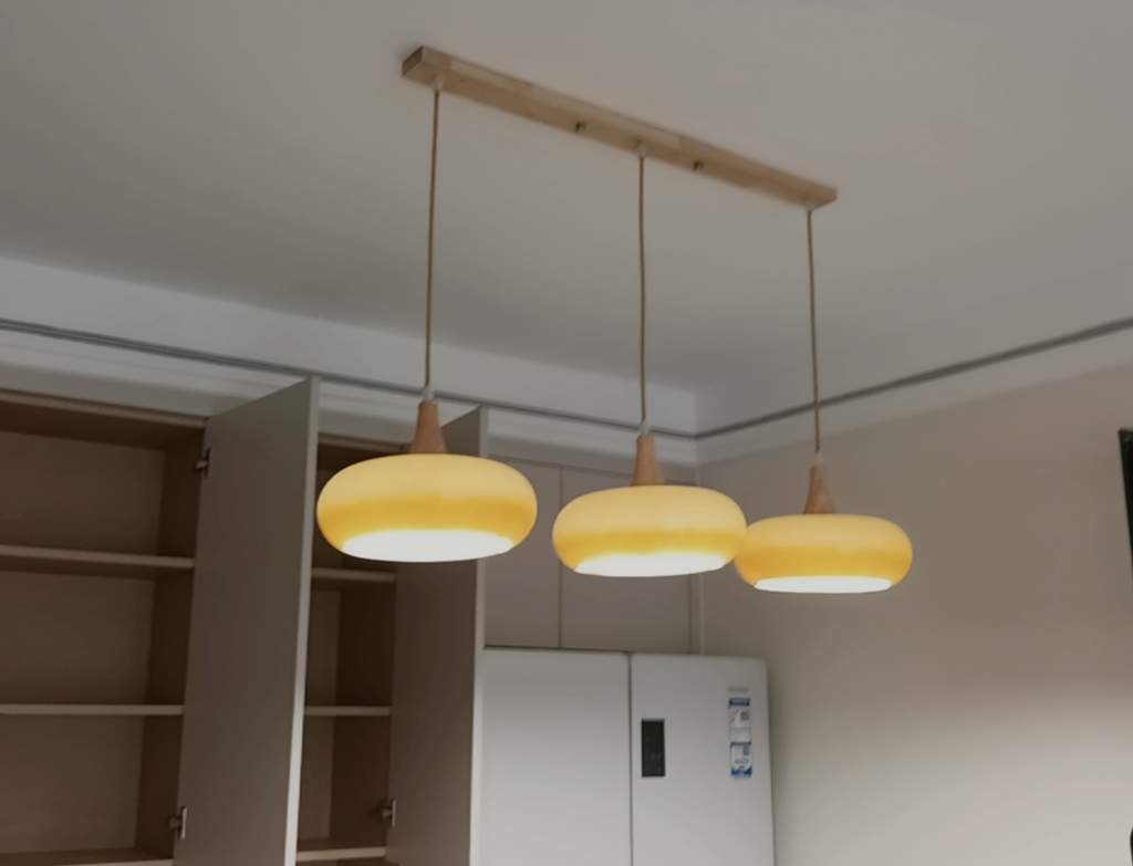
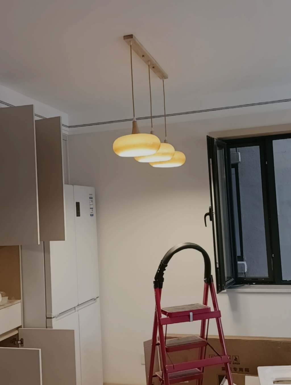
We installed three in a row and they look fantastic together. The matching wooden ceiling bar ties them into the cabinetry, while the orange shades add a lovely bit of contrast.
The clean lines and balanced form provide a calming presence. It feels like a gentle recommendation for minimalist interiors.
The piece commands attention through its structural simplicity and clean lines. It establishes a focal point that feels both grounded and airy, offering a sophisticated presence in any setting.
The curves create such a gentle visual flow. It really anchors the room with a quiet confidence.
I probably wouldn’t have chosen such a warm colour in a very angular shade, but the smooth curved form makes it feel much more relaxed. It has a slightly retro charm without looking dated.
It manages to feel sophisticated yet distinctly personal, striking a rare balance that avoids being too formal or too casual for the space.
The form feels intentionally balanced, merging soft curves with structural simplicity in a way that defines the space. It offers a sophisticated atmosphere without demanding attention through noise or clutter. I find this approach refreshing, as it lets the silhouette speak for itself while maintaining an elegant and cohesive visual rhythm throughout the room.
I wanted wood in the design but didn’t want the whole pendant to be brown or beige. The coloured shade gives it more personality while still keeping that natural warmth around the top.
The artistic presence of this fixture feels intentional and balanced. Clean lines create a gentle visual rhythm that enhances the space without overwhelming it. There is a sense of structural simplicity paired with elegant form, resulting in an atmosphere of refined calm. It stands as a testament to harmonious design where every curve serves a purpose.
The silhouette has a lovely rhythm that catches the eye gently. If you want something with quiet elegance and clean lines, this hits the mark perfectly for me.