





Diteruku Modern Linear 2 Colour Wall Lamp
Description
| Product Details | |
| Type | Wall Lamp |
| Style | Diteruku |
| Suggested Space Fit | Living Room/Dining Room/Bedroom |
| Suggested Room Size | 10㎡-15㎡ |
| Indoor or Outdoor Use | Indoor |
| Dimmable | No |
| Colour Temperature | Warm Light |
| Smart Enabled | / |
| Need Assembly | Yes |
| IP Rate | IP20 |
| Power Source | Hardwire |
| Light Source | |
| Bulb Included | Yes |
| Bulb Type | LED |
| Bulb Base | SMD |
| Number of Bulb | 1 |
| Voltage (V) | 110V-240V |
| Maximum Wattage(W) | / |
| Material | |
| Primary Material | Metal+Acrylic |
| Fixture Material | Metal |
| Shade Material | Acrylic |
| Dimensions | |
| Product Weight | / |
| Chain/Cord Adjustable or Not | No |
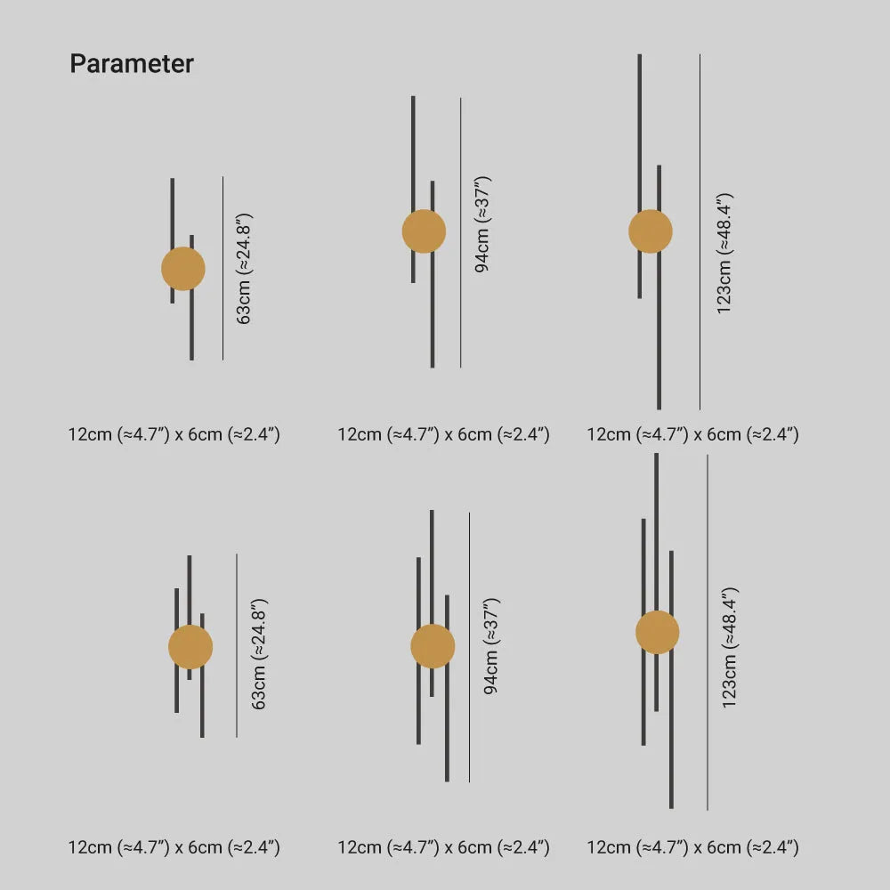
| Size | See Images |
| Package Contents | |
| 1* Wall Lamp | |
| Note | |
| The size is manually measured, there will be an error of 1-3cm. Because of the difference in light, there may be slight chromatic aberration. We appreciate your understanding in advance. We recommend that you'd better let a professional electrician to install it | |
- Made from high-quality metal, Diteruku wall light features a minimalist design featuring smooth lines and elegant circles.With its contemporary aesthetic, it would look stunning in any modern home.
- Diteruku wall lights are available in two stunning colours: classic black and refined gold. The combination of colours creates a sense of understated luxury in your home.Whether you choose the simple elegance of black or the rich charm of gold, these hues blend effortlessly into any design scheme, adding depth and character to your surroundings.
- Add contemporary elegance to your living space with the Diteruku wall light, a striking interplay of shape and form.Featuring clean lines and graceful curves, the minimalist design adds a modern touch to any room.
- Transform any room into a sanctuary of style and elegance with the versatile Diteruku wall light. This lamp is perfect for living rooms, bedrooms and more, enhancing the ambience of any room with its understated elegance.
| Product Details | |
| Type | Wall Lamp |
| Style | Diteruku |
| Suggested Space Fit | Living Room/Dining Room/Bedroom |
| Suggested Room Size | 10㎡-15㎡ |
| Indoor or Outdoor Use | Indoor |
| Dimmable | No |
| Colour Temperature | Warm Light |
| Smart Enabled | / |
| Need Assembly | Yes |
| IP Rate | IP20 |
| Power Source | Hardwire |
| Light Source | |
| Bulb Included | Yes |
| Bulb Type | LED |
| Bulb Base | SMD |
| Number of Bulb | 1 |
| Voltage (V) | 110V-240V |
| Maximum Wattage(W) | / |
| Material | |
| Primary Material | Metal+Acrylic |
| Fixture Material | Metal |
| Shade Material | Acrylic |
| Dimensions | |
| Product Weight | / |
| Chain/Cord Adjustable or Not | No |
| Size | See Images |
| Package Contents | |
| 1* Wall Lamp | |
| Note | |
| The size is manually measured, there will be an error of 1-3cm. Because of the difference in light, there may be slight chromatic aberration. We appreciate your understanding in advance. We recommend that you'd better let a professional electrician to install it | |
- Made from high-quality metal, Diteruku wall light features a minimalist design featuring smooth lines and elegant circles.With its contemporary aesthetic, it would look stunning in any modern home.
- Diteruku wall lights are available in two stunning colours: classic black and refined gold. The combination of colours creates a sense of understated luxury in your home.Whether you choose the simple elegance of black or the rich charm of gold, these hues blend effortlessly into any design scheme, adding depth and character to your surroundings.
- Add contemporary elegance to your living space with the Diteruku wall light, a striking interplay of shape and form.Featuring clean lines and graceful curves, the minimalist design adds a modern touch to any room.
- Transform any room into a sanctuary of style and elegance with the versatile Diteruku wall light. This lamp is perfect for living rooms, bedrooms and more, enhancing the ambience of any room with its understated elegance.
Secure Payment
Trusted secure payment, currently accept major credit cards (VISA, Mastercard, AMEX, etc.) and PayPal. Fortified with advanced SSL encryption technology, provides a reliable shield to safeguard your sensitive personal and financial information.
Trusted secure payment, currently accept major credit cards (VISA, Mastercard, AMEX, etc.) and PayPal. Fortified with advanced SSL encryption technology, provides a reliable shield to safeguard your sensitive personal and financial information.
Return Policy
Upon delivery of the goods, you will promptly examine them. If any of the goods ordered have been damaged in transit or have been incorrectly shipped, does not meet your requirements or are defective through faulty material or factory workmanship. Please kindly notify us by writing to us through email at contact@cielum.co.uk within 30 days from the date of delivery of the relevant goods.
Upon delivery of the goods, you will promptly examine them. If any of the goods ordered have been damaged in transit or have been incorrectly shipped, does not meet your requirements or are defective through faulty material or factory workmanship. Please kindly notify us by writing to us through email at contact@cielum.co.uk within 30 days from the date of delivery of the relevant goods.
Lamp Knowledge Science
*A general explanation of the product features for all lighting fixtures. It doesn't mean the product on the current page is dimmable or three colours changeable.
Please check the Description section to find whether the current product is dimmable or not.
- Dimmable version: equipped with a remote control, and can adjust the brightness and colour temperature of the light, not compatible with dimmers.
- Triac Dimmable (Wall Switch Control): Compatible with most standard LED silicon-controlled (Triac) wall dimmers(not included). This version allows you to adjust brightness via your existing wall switch but does not include a remote.
- Three-colour changed by switch version: Controlled by a standard wall switch(not included), allowing you to adjust the color temperature of the light. This version does not have a memory function. Each time the light is turned on, it will reset to the default setting.
Size Tolerance Notice:
All dimensions are manually measured. Due to the unique shapes or craftsmanship of certain lighting fixtures, a deviation of 1-3cm is within the normal range. Please refer to the actual product received for precise installation.
Colour Disclaimer:
Actual colours may vary slightly due to different monitor settings, room ambient light, or the colour temperature of the bulbs used. We appreciate your understanding.
*A general explanation of the product features for all lighting fixtures. It doesn't mean the product on the current page is dimmable or three colours changeable.
Please check the Description section to find whether the current product is dimmable or not.
- Dimmable version: equipped with a remote control, and can adjust the brightness and colour temperature of the light, not compatible with dimmers.
- Triac Dimmable (Wall Switch Control): Compatible with most standard LED silicon-controlled (Triac) wall dimmers(not included). This version allows you to adjust brightness via your existing wall switch but does not include a remote.
- Three-colour changed by switch version: Controlled by a standard wall switch(not included), allowing you to adjust the color temperature of the light. This version does not have a memory function. Each time the light is turned on, it will reset to the default setting.
Size Tolerance Notice:
All dimensions are manually measured. Due to the unique shapes or craftsmanship of certain lighting fixtures, a deviation of 1-3cm is within the normal range. Please refer to the actual product received for precise installation.
Colour Disclaimer:
Actual colours may vary slightly due to different monitor settings, room ambient light, or the colour temperature of the bulbs used. We appreciate your understanding.

The long vertical bars create such a strong composition that the fitting still looks decorative when it is switched off. It has given an otherwise empty wall a real sense of purpose.
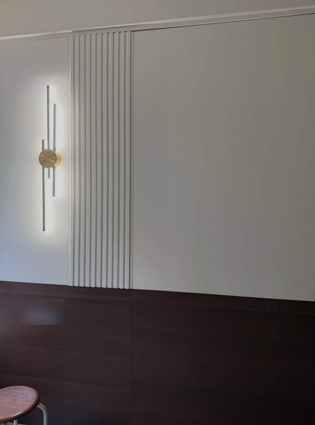
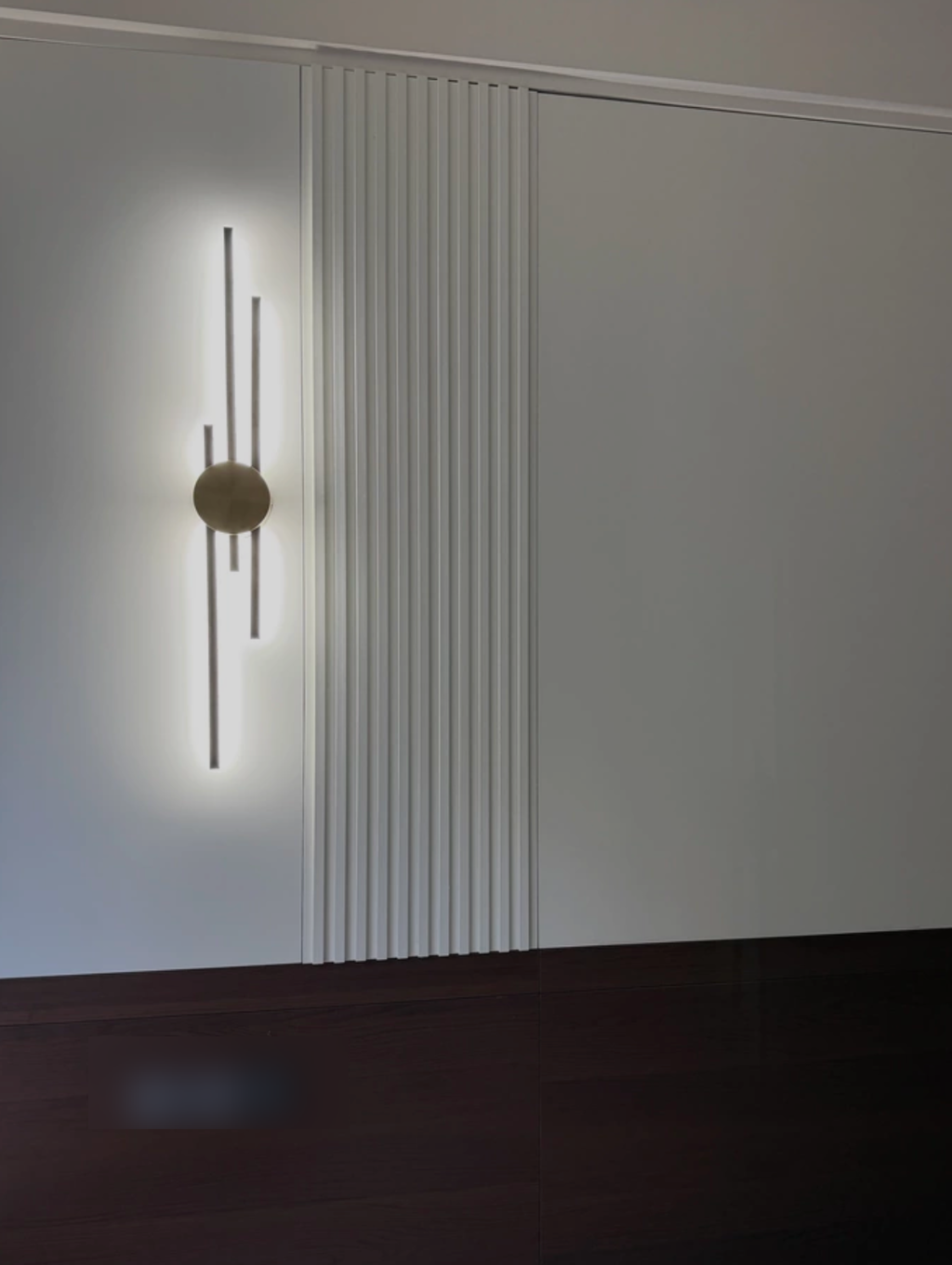
I wanted something graphic for a plain hallway wall, and this has exactly the right balance. The alternating dark and warm metal lines give it structure, while the circular centre keeps the design from feeling too severe.
The arrangement settles into the room with a quiet confidence. It feels intentional and balanced, creating a serene backdrop that just works.
I imagined a louder visual statement given the bold lines, but the result is surprisingly serene. The vertical rhythm feels more like a gentle whisper than a shout, creating a calm focal point that anchors the wall without demanding attention. It has a subtle elegance I didn't anticipate.
The arrangement creates a sense of movement through height and geometric precision. Vertical lines meet circular forms to produce a visual rhythm that feels balanced and calm, giving the display a dynamic yet serene quality.
I was curious how the interplay of simple shapes would feel in practice. It turned out to be a warm, conversational addition that maintains a neutral character while adding depth.
I nearly chose a completely black wall light, but the gold sections make this far warmer and more interesting. They catch just enough light to create contrast without looking flashy.
I wondered how such strict lines would feel in a living area, but the composition proves surprisingly inviting. The interplay of height and circle forms a sophisticated backdrop without overwhelming the room.
I notice how the geometric lines make the area feel more deliberate. The spacing and rhythm create a sophisticated atmosphere that elevates the entire setting.
Deliberate spacing creates a rhythmic visual balance that emphasizes height. This minimalist approach yields a comfortable atmosphere without excess ornamentation.
Most decorative sconces I looked at were too wide for the space beside our console. The tall linear form fits beautifully and actually makes the wall feel higher.
It gives a plain setting more character through subtle elegance. The combination of height emphasis and minimalism adds a layer of artistry without introducing unnecessary complexity.
I really like that the bars aren’t arranged in a perfectly repetitive pattern. The slight shifts in height and colour give the fitting movement and stop the whole thing feeling too formal.
It is rare to find such controlled artistry that still manages to feel so approachable and serene.
The black lines stand out sharply, while the gold tones soften the contrast. It’s one of those combinations that feels modern without making the room look cold.
The rhythmic balance of vertical and circular elements creates a quietly elegant presence that feels both intentional and refined.
We used one on each side of the headboard and the result is much cleaner than having table lamps. The long vertical design frames the bed beautifully and gives the room a more tailored look.
The atmosphere feels sophisticated and timeless, prioritizing refined elegance over fleeting trends through careful geometric balance.
Without the circular detail I think the design might have felt overly rigid. That simple shape in the middle gives the eye somewhere to settle and makes the whole composition feel much more balanced.
The interplay of simple shapes establishes a distinct visual identity without any excess ornamentation. It maintains a neutral character while delivering a polished look that feels intentional and refined.
Our room already has quite a lot of artwork, so I needed lighting that would add interest without competing with everything else. This has a strong silhouette but remains visually light.
The geometric precision here creates a mood that lingers long after you look away. It achieves a sophisticated atmosphere without relying on ornamentation, making the space feel intentionally curated rather than just decorated.
That was important to me because I didn’t want the fitting to feel glamorous. The warm metal acts more like an accent against the black and gives the design a refined finish.
The vertical bars draw your eye upwards and make our small hallway wall feel much more substantial. It’s a simple visual effect, but it changed the proportions of the space more than I expected.
I really enjoy how the minimalism and neutral character combine to create such a clean, modern atmosphere that feels effortlessly sophisticated.
I kept noticing how the bars step up and down rather than ending at the same level. That variation makes the fitting feel designed and slightly sculptural instead of just geometric.
We have black door handles and warmer metal details elsewhere, so this wall light connects the two finishes nicely. It helped the room feel much more cohesive without matching everything exactly.
The long vertical elements make any slight tilt easy to notice, so we spent a little extra time getting the fitting perfectly straight. Once level, it looked excellent, so that small installation fuss is my only reason for four stars.