



Gedinit Modern Teardrop Crystal Chandelier, Gold
Description

| Feature | |
| Type | Chandelier |
| Style | Gedinit |
| Suggested Space Fit | Living Room |
| Suggested Room Size | 5㎡ -10㎡ |
| Indoor or Outdoor Use | Indoor |
| Colour Temperature | Natural Light |
| Dimmable | No |
| Smart Enabled | / |
| Need Assembly | Yes |
| IP Rate | IP20 |
| Power Source | Hardwire |
| Bulb Information | |
| Bulb Included | Yes |
| Bulb Type | LED |
| Bulb Base | SMD |
| Number of Bulb | 10/15/20 |
| Voltage (V) | 110V-240V |
| Maximum Wattage(W) | / |
| Material | |
| Primary Material | Metal+Crystal |
| Fixture Material | Metal |
| Shade Material | Crystal |
| Weights&Dimensions | |
| Product Weight | / |
| Chain/Cord Adjustable or Not | No |
| Size | See Images |
| Package Contents | |
| 1* Chandelier | |
| Note | |
| The size is manually measured, there will be an error of 1-3cm. Because of the difference in light, there may be slight chromatic aberration. We appreciate your understanding in advance. We recommend that you'd better let a professional electrician to install it | |
- The integrity of the Hailey chandelier with its mix of design accuracy and material solidity makes an impression that is both aesthetic contemporary and enduring. Its corrosion-resistant frame allows the artwork to remain fresh and sophisticated even after years of usage. This looks excellently stylish with your domestic furnishing. Let yourself give in to the extravagance of superior craftsmanship, where each component is specially chosen to extend longevity and cultivate visuals.
- Imagine flickering lights within the euphoric spell cast by Hailey chandelier and see how gleaming gold shades fulfill this imagination with dancing and interacting shadows. The interaction between lights create the pattern which eventually sets an ambience of opulence. As such, your room which is now a shining oasis will exude luxury and sophistication.
- Plung into the Hailey chandelier contemporary allurement and admire the masterpiece that is a teardrop lampshade complemented with a both beautiful and vibrant colours. Sleek lines and contemporary design fabrics provide a subtle air of chic sophistication to the ambience of any place, giving it an instant modern transformation of the decor without having to spend much. And through the quality workmanship of the metal lamp rope, allow it to also enhance the beauty of your growing space, giving a note of style and edge. Take a step towards exquisite interior decoration and create a statement piece, which combines functionality with style. It's a harmony of the two.
- Familiarize with the versatility of the Hailey chandelier that comes in 10, 15 and 20 bulbs variant so as to work with the different scenes and ceiling heights. Whatever space of your home you want to, whether living room, bedroom or any other, by the adding of this chandelier you will receive a bright and luxurious mood, with the timeless elegance. Let it take the center stage of your interior decor, enhancing the ambience with harmony and warmth that provides an amazing opportunity to get cozy and carefree. Transform your ceiling into a glistening center of elegance and sophistication with the statement-making Hailey chandelier.
- Be a part of an elite group that considers the Hailey chandelier; a flexible and stylish addition to any contemporary design. By virtue of the mix of its beautiful chic metal frame and clever lamp shade, the lamp becomes a piece that rises above trends, enhancing the room in a way that will never be outdated or go out of style. Regardless if your decor is contemporary, classic, or mixed, this chandelier tastefully blends with any look to give your space some spice for glam and elegance.
| Feature | |
| Type | Chandelier |
| Style | Gedinit |
| Suggested Space Fit | Living Room |
| Suggested Room Size | 5㎡ -10㎡ |
| Indoor or Outdoor Use | Indoor |
| Colour Temperature | Natural Light |
| Dimmable | No |
| Smart Enabled | / |
| Need Assembly | Yes |
| IP Rate | IP20 |
| Power Source | Hardwire |
| Bulb Information | |
| Bulb Included | Yes |
| Bulb Type | LED |
| Bulb Base | SMD |
| Number of Bulb | 10/15/20 |
| Voltage (V) | 110V-240V |
| Maximum Wattage(W) | / |
| Material | |
| Primary Material | Metal+Crystal |
| Fixture Material | Metal |
| Shade Material | Crystal |
| Weights&Dimensions | |
| Product Weight | / |
| Chain/Cord Adjustable or Not | No |
| Size | See Images |
| Package Contents | |
| 1* Chandelier | |
| Note | |
| The size is manually measured, there will be an error of 1-3cm. Because of the difference in light, there may be slight chromatic aberration. We appreciate your understanding in advance. We recommend that you'd better let a professional electrician to install it | |
- The integrity of the Hailey chandelier with its mix of design accuracy and material solidity makes an impression that is both aesthetic contemporary and enduring. Its corrosion-resistant frame allows the artwork to remain fresh and sophisticated even after years of usage. This looks excellently stylish with your domestic furnishing. Let yourself give in to the extravagance of superior craftsmanship, where each component is specially chosen to extend longevity and cultivate visuals.
- Imagine flickering lights within the euphoric spell cast by Hailey chandelier and see how gleaming gold shades fulfill this imagination with dancing and interacting shadows. The interaction between lights create the pattern which eventually sets an ambience of opulence. As such, your room which is now a shining oasis will exude luxury and sophistication.
- Plung into the Hailey chandelier contemporary allurement and admire the masterpiece that is a teardrop lampshade complemented with a both beautiful and vibrant colours. Sleek lines and contemporary design fabrics provide a subtle air of chic sophistication to the ambience of any place, giving it an instant modern transformation of the decor without having to spend much. And through the quality workmanship of the metal lamp rope, allow it to also enhance the beauty of your growing space, giving a note of style and edge. Take a step towards exquisite interior decoration and create a statement piece, which combines functionality with style. It's a harmony of the two.
- Familiarize with the versatility of the Hailey chandelier that comes in 10, 15 and 20 bulbs variant so as to work with the different scenes and ceiling heights. Whatever space of your home you want to, whether living room, bedroom or any other, by the adding of this chandelier you will receive a bright and luxurious mood, with the timeless elegance. Let it take the center stage of your interior decor, enhancing the ambience with harmony and warmth that provides an amazing opportunity to get cozy and carefree. Transform your ceiling into a glistening center of elegance and sophistication with the statement-making Hailey chandelier.
- Be a part of an elite group that considers the Hailey chandelier; a flexible and stylish addition to any contemporary design. By virtue of the mix of its beautiful chic metal frame and clever lamp shade, the lamp becomes a piece that rises above trends, enhancing the room in a way that will never be outdated or go out of style. Regardless if your decor is contemporary, classic, or mixed, this chandelier tastefully blends with any look to give your space some spice for glam and elegance.
Secure Payment
Trusted secure payment, currently accept major credit cards (VISA, Mastercard, AMEX, etc.) and PayPal. Fortified with advanced SSL encryption technology, provides a reliable shield to safeguard your sensitive personal and financial information.
Trusted secure payment, currently accept major credit cards (VISA, Mastercard, AMEX, etc.) and PayPal. Fortified with advanced SSL encryption technology, provides a reliable shield to safeguard your sensitive personal and financial information.
Return Policy
Upon delivery of the goods, you will promptly examine them. If any of the goods ordered have been damaged in transit or have been incorrectly shipped, does not meet your requirements or are defective through faulty material or factory workmanship. Please kindly notify us by writing to us through email at contact@cielum.co.uk within 30 days from the date of delivery of the relevant goods.
Upon delivery of the goods, you will promptly examine them. If any of the goods ordered have been damaged in transit or have been incorrectly shipped, does not meet your requirements or are defective through faulty material or factory workmanship. Please kindly notify us by writing to us through email at contact@cielum.co.uk within 30 days from the date of delivery of the relevant goods.
Lamp Knowledge Science
*A general explanation of the product features for all lighting fixtures. It doesn't mean the product on the current page is dimmable or three colours changeable.
Please check the Description section to find whether the current product is dimmable or not.
- Dimmable version: equipped with a remote control, and can adjust the brightness and colour temperature of the light, not compatible with dimmers.
- Triac Dimmable (Wall Switch Control): Compatible with most standard LED silicon-controlled (Triac) wall dimmers(not included). This version allows you to adjust brightness via your existing wall switch but does not include a remote.
- Three-colour changed by switch version: Controlled by a standard wall switch(not included), allowing you to adjust the color temperature of the light. This version does not have a memory function. Each time the light is turned on, it will reset to the default setting.
Size Tolerance Notice:
All dimensions are manually measured. Due to the unique shapes or craftsmanship of certain lighting fixtures, a deviation of 1-3cm is within the normal range. Please refer to the actual product received for precise installation.
Colour Disclaimer:
Actual colours may vary slightly due to different monitor settings, room ambient light, or the colour temperature of the bulbs used. We appreciate your understanding.
*A general explanation of the product features for all lighting fixtures. It doesn't mean the product on the current page is dimmable or three colours changeable.
Please check the Description section to find whether the current product is dimmable or not.
- Dimmable version: equipped with a remote control, and can adjust the brightness and colour temperature of the light, not compatible with dimmers.
- Triac Dimmable (Wall Switch Control): Compatible with most standard LED silicon-controlled (Triac) wall dimmers(not included). This version allows you to adjust brightness via your existing wall switch but does not include a remote.
- Three-colour changed by switch version: Controlled by a standard wall switch(not included), allowing you to adjust the color temperature of the light. This version does not have a memory function. Each time the light is turned on, it will reset to the default setting.
Size Tolerance Notice:
All dimensions are manually measured. Due to the unique shapes or craftsmanship of certain lighting fixtures, a deviation of 1-3cm is within the normal range. Please refer to the actual product received for precise installation.
Colour Disclaimer:
Actual colours may vary slightly due to different monitor settings, room ambient light, or the colour temperature of the bulbs used. We appreciate your understanding.

I was looking for something glamorous, but I didn’t want the room to feel cold or overly formal. The warm gold tone balances the crystal beautifully and gives the chandelier a softer, more welcoming look.
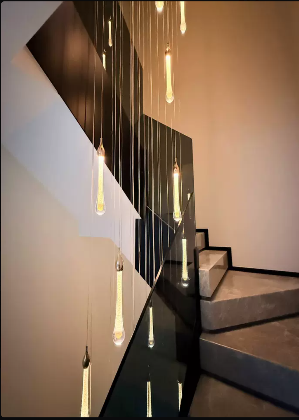
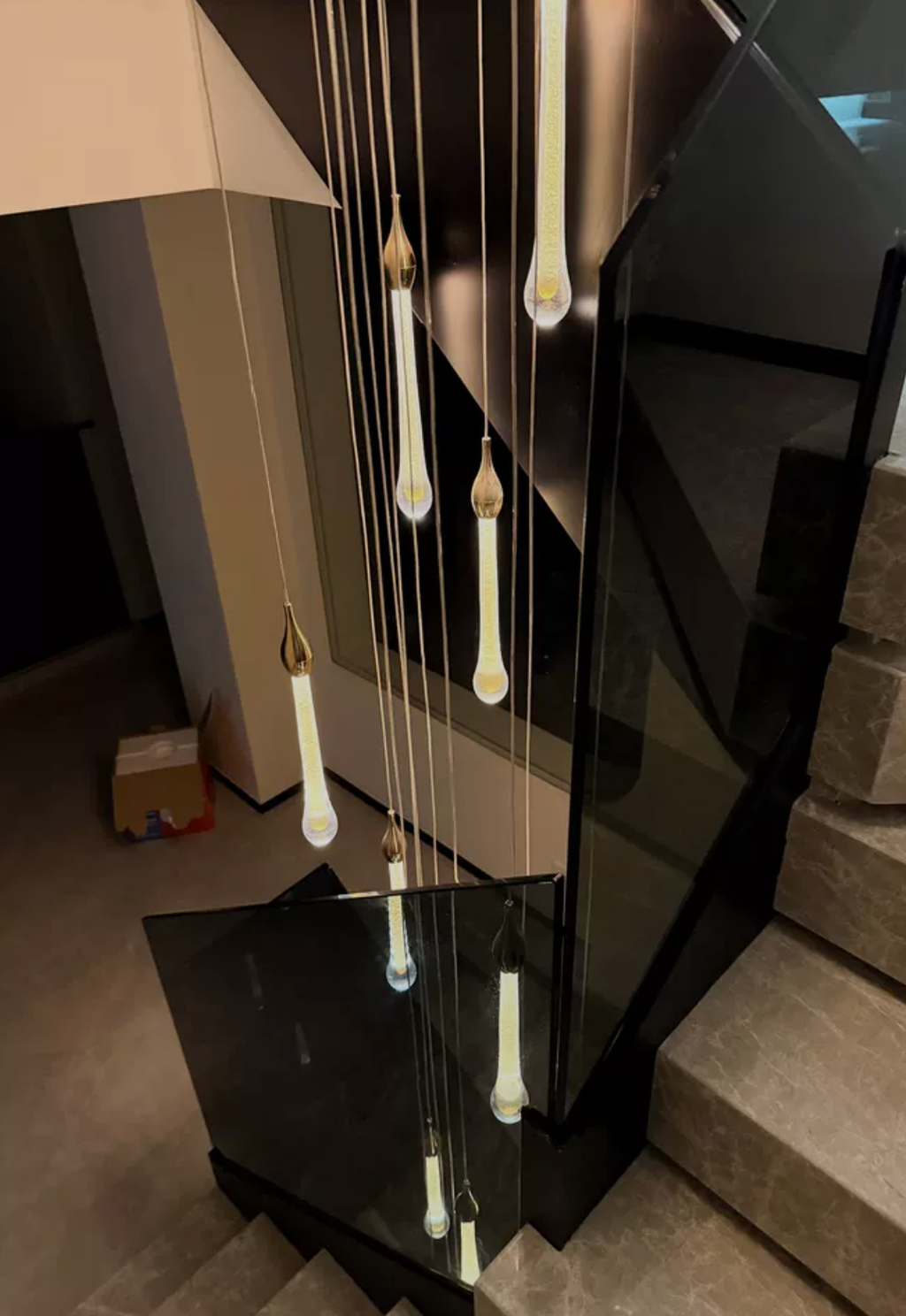
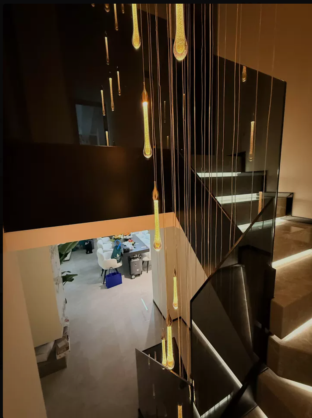
I chose this because the overall form felt different from the usual options without being difficult to work around. After the initial novelty wore off, I still notice the design in a good way. The Gold finish works well without needing every other finish in the room to match. It was a simple change that made the room feel much more finished.
I almost chose something safer, but I'm glad I went with a fitting that has a little more personality. The Gold finish works well without needing every other finish in the room to match. The design has personality without feeling like something that will look dated quickly. I would happily make the same choice again.
I appreciate that it looks good with everyday furniture and doesn't need a styled backdrop. I chose this because the overall form felt different from the usual options without being difficult to work around. The fabric has more depth in person than I expected. The whole setup feels more intentional now.
It looked elegant in images but feels even more substantial in person. The overall form carries a quiet confidence that anchors the room perfectly.
The design has personality without feeling like something that will look dated quickly. I wasn't sure how it would translate from the product photos to a real room, but it feels much more natural in person. We chose the Gold version and the finish feels richer in person. It works just as well visually when the light is off.
The teardrop crystals create such a beautiful sense of movement from top to bottom. We installed this in the stairwell and it immediately made the whole area feel taller, brighter and much more refined.
This feels refined rather than trendy. It establishes a calm, sophisticated atmosphere that endures beyond fleeting styles.
In the living room, it has presence without taking over the space. This was one of the few designs I kept coming back to after comparing a lot of alternatives. For us, it ended up being the right amount of personality. The silhouette reads cleanly from across the room and shows more detail when you're closer.
It looks considered without making everything else in the room feel too casual. I wanted a design that would still contribute to the room during the day when the light itself wasn't the focus. The Gold finish works well without needing every other finish in the room to match. It has been easy to live with every day.
After the initial novelty wore off, I still notice the design in a good way. I wasn't looking for a statement piece exactly, just something that would give the room a clearer focal point. I especially like how the fabric looks in natural light. It was a simple change that made the room feel much more finished.
The metal gives the design texture without making it feel busy. The old light worked fine but didn't add much to the room, so this was a noticeable upgrade. I would happily make the same choice again. After the initial novelty wore off, I still notice the design in a good way.
It looks considered without making everything else in the room feel too casual. I wanted a fitting that looked considered but didn't require a perfectly styled room around it. It feels right at home in our bedroom. It feels settled in instead of newly added.
The fitting feels polished, but the room still looks comfortable and lived in. I wanted something with more character than the fitting we had before, but nothing that would make the room feel overdone. Being able to adjust the brightness is useful later in the evening. It feels settled in instead of newly added.
I notice how the vertical lines create such balance. The staggered elements guide the eye smoothly downward without feeling chaotic or rigid.
The arrangement adds distinct character to otherwise plain surroundings. Its presence is subtle yet unmistakably sophisticated.
I wanted a fitting that looked considered but didn't require a perfectly styled room around it. The Gold finish works well without needing every other finish in the room to match. It looks considered without making everything else in the room feel too casual. It works just as well visually when the light is off.
What impressed me most is how elegant it looks without becoming bulky. The hanging drops give it plenty of presence, but because everything falls vertically, it still feels airy and graceful.
I wasn't sure how it would translate from the product photos to a real room, but it feels much more natural in person. It feels right at home in our bedroom. Natural daylight brings out details that were hard to judge on a screen. The result feels balanced rather than overdone.
It gives the area a focal point while leaving plenty of breathing room around it. I wanted a fitting that looked considered but didn't require a perfectly styled room around it. It feels right at home in our bedroom. The whole setup feels more intentional now.
I wanted a design that would still contribute to the room during the day when the light itself wasn't the focus. After the initial novelty wore off, I still notice the design in a good way. The crystal has more depth in person than I expected. The whole setup feels more intentional now.
We chose the Gold version and the finish feels richer in person. This was one of the few designs I kept coming back to after comparing a lot of alternatives. It was a simple change that made the room feel much more finished. Natural daylight brings out details that were hard to judge on a screen. My only advice is to measure the intended spot first so the scale feels right.
This was bought for our entrance and it has completely changed the first impression of the house. Guests notice it straight away, especially when the crystals catch the evening light.
Photos don’t really show how lovely the crystal pieces look when viewed from different angles. They reflect the light very softly and make the fitting feel much more luxurious than a standard chandelier.
The rhythmic repetition and elegant restraint create a sophisticated atmosphere that feels deeply considered. Verticality and graceful suspension bring visual harmony, making the room feel curated rather than accidental.
The rhythmic stacking of suspended elements creates a calm, sophisticated presence that feels both ordered and effortlessly graceful in the room.
It manages to feel sculptural without sacrificing warmth, creating a space that is both refined and deeply inviting.
I didn’t want anything too traditional, and this was exactly the right mix. The overall shape feels modern and clean, while the crystal drops add enough elegance to make the room feel special.
I was expecting something more traditional, but this unexpected arrangement of suspended elements offers a unique, controlled aesthetic. The elegant restraint and visual harmony make it a standout piece that defies simple categorization.
I anticipated a standard modern look, but the elegant restraint and consistent spacing offer something far more sophisticated. The graceful suspension adds a layer of artistry that transforms the visual presence of the area into a cohesive whole.